import pandas as pd
from dfply import *
from plotnine import *
import ssl0. Loading Libraries
1. Data Loading and Data Manipulation
## adding below ssl line as it is giving ssl error locally in my machine
ssl._create_default_https_context = ssl._create_unverified_context

data = pd.read_csv('https://raw.githubusercontent.com/rfordatascience/tidytuesday/master/data/2024/2024-03-12/fiscal_sponsor_directory.csv')

data = ( data >>
        mutate(
               fiscal_sponsor_since = 2022 - X.year_fiscal_sponsor,
               fee = X['fiscal_sponsorship_fee_description'].str.extract(r'(\d[-+]?%?.?\d?%)')
               )
        ) >>  (
               mutate(
    fee = X['fee'].str.extract(r'(^\d?+[\.]?\d?+)'))
               )

data['fee'] = data['fee'].astype(float)
2. Plotting
2.1. Total Sponsorships Duration and Projects
Total Sponsorships Duration and Projects Plot Code
(data >>
 ggplot(aes(x= "fiscal_sponsor_since",y="n_sponsored",color="year_fiscal_sponsor")) +
 geom_point() +
 theme_minimal() +
 labs(
     x = "Years since Fiscal Sponsorship",
     y = "Number of Sponsored Projects",
     title = "Relationship between Total Sponsorships and Duration of Sponsorship",
     subtitle = "Legend of colors is on Fiscal Sponsorship year",
     caption = "Axis is zoomed to have a better visualization"
 ) +
  guides(color=guide_legend(title="")) +  # Use an empty string to remove the legend title
  theme(
      legend_position=(0.5, 0.85),
      panel_grid_minor_x = element_blank(),
      panel_grid_minor_y = element_blank()
  ) +
   coord_cartesian(
    ylim = (0, 400),
    xlim = (0,75)
    ) +
   annotate(
       "text",
       x = 60,
       y = 200,
       label = "Older Sponsors doesn't mean \n more sponsored projects ",
       color = "brown",
       size = 8
       )
 )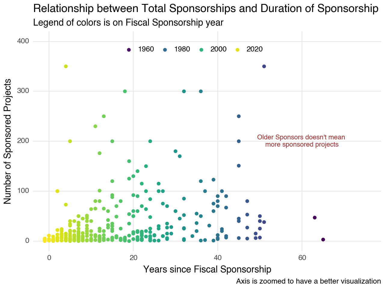
Sponsors who began sponsoring in recent years tend to have a lower number of sponsored projects, which aligns with our intuition. However, sponsors who commenced sponsorship fifty years ago exhibit a comparable number of projects to those of more recent sponsors. Upon closer examination of the last twenty years, the number of projects appears to demonstrate a linear relationship with the launch of sponsorship
2.2. Histogram of Total Sponsored Projects
Histogram of Total Sponsored Projects Plot Code
(data >>
 ggplot(aes(x="n_sponsored")) +
 geom_histogram(position="dodge",fill = "#4169E1") +
 theme_minimal() +
 labs (
     x = "Number of Sponsored Projects",
     y = "",
     title = "Histogram of total Sponsored projects"
 ) +
 theme(
      panel_grid_major_y = element_blank(),
      panel_grid_minor_x = element_blank(),
      panel_grid_minor_y = element_blank()
  ) +
   annotate(
       "text",
       x = 200,
       y = 80,
       label = "Most of the sponsors \n sponsored only one/two project ",
       color = "brown",
       size = 8
       )
 )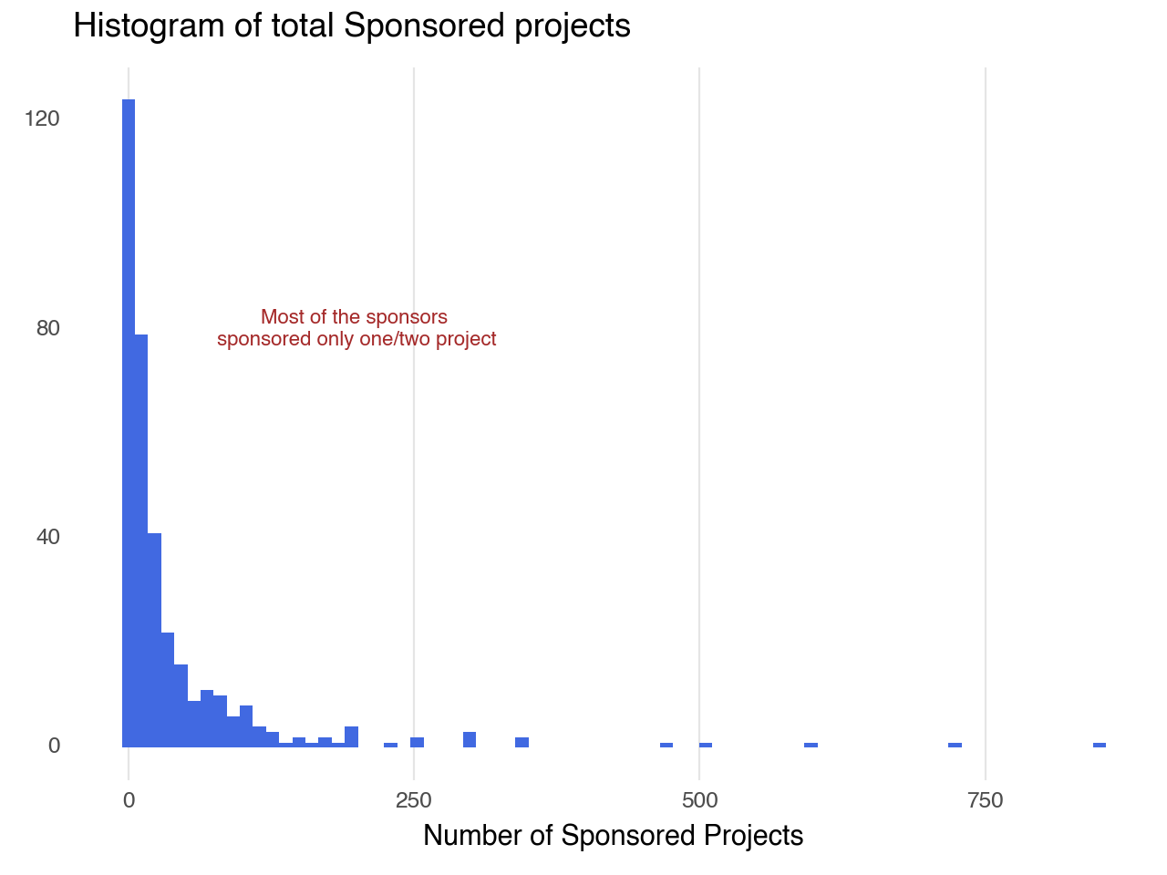
Most sponsors have one or two projects, while a few have a significantly higher number, indicating a long tail of active involvement.
2.3. Histogram of Fiscal Sponsorship Fee
Histrogram of Fiscal Sponsorship Fee Plot Code
(data >>
 ggplot(aes(x="fee")) +
 geom_histogram(position="dodge", fill = "#708090") +
 theme_minimal() +
 labs (
     x = "Sponsorship Fee%",
     y = "",
     title = "Histogram of fees associated with fiscal sponsorship",
     caption = "Axis is zoomed to have a better visualization"
 ) +
 theme(
      panel_grid_major_y = element_blank(),
      panel_grid_minor_x = element_blank(),
      panel_grid_minor_y = element_blank()
  ) +
   coord_cartesian(
    xlim = (0, 15),
    ) +
   annotate(
       "text",
       x = 13,
       y = 50,
       label = "Median range of sponsorship \n fee is b/w 5% & 10% ",
       color = "brown",
       size = 8
       )
 )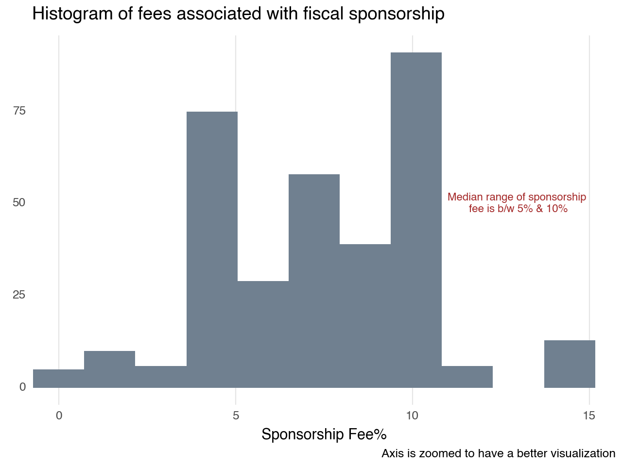
As annotated in the plot most of the fiscal sponsorship fee starts at 5% to 10%.